2024082913:22:12
Trend Charts in Lab / Medical Diagnostics Report Printouts
Published by: Mohammed Siddiq

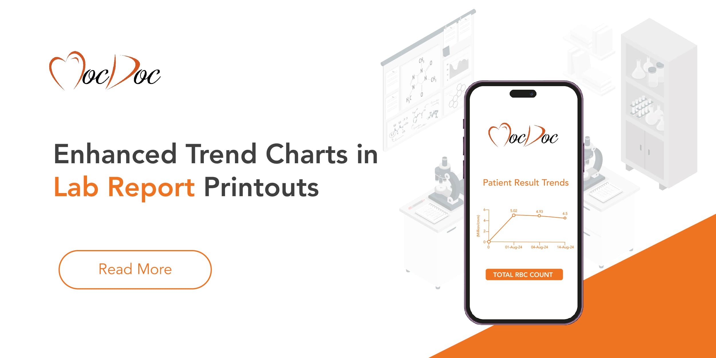
In the ever-evolving world of medical diagnostics, the ability to quickly and accurately interpret lab results is crucial. Our latest upgrade to the trend charts in lab report printouts marks a significant advancement in how data is presented and analyzed. This enhancement promises to provide healthcare professionals with a more intuitive and informative way to track patient test results over time.
What’s New?
Previously, the trend charts in lab report printouts had some limitations that affected their utility:
No Result Values Displayed: The trend charts lacked specific result values on the X and Y axes, making it challenging for users to interpret data trends and changes accurately.
Single Trend Chart Per Row: Each row in the report featured only one trend chart, leading to inefficient use of space and making it harder to view multiple trends simultaneously.
Our recent enhancement addresses these issues with the following improvements:
Result Values Displayed:
🔍 Enhanced Clarity: Result values are now prominently displayed on both the X and Y axes of the trend charts. This addition allows users to easily see and understand the data points, providing a clearer view of how test results have changed over time.
📈 Better Data Analysis: By showing result values, healthcare professionals can more accurately assess patient progress and trends, making it easier to identify any significant changes or anomalies.
Compact Layout:
📅 Two Trend Charts Per Row: The updated design now features two trend charts per row, optimizing the layout and making better use of available space. This compact arrangement allows for a more comprehensive view of multiple trends in a single glance.
🗂️ Improved Usability: The new layout ensures that users can efficiently compare different test results and track multiple parameters without needing to scroll through numerous pages.
Why This Matters
Enhanced Data Interpretation:
📊 Detailed Insights: With result values displayed, users can gain deeper insights into patient data. This feature helps in understanding the magnitude of changes in test results, facilitating more informed clinical decisions.
📉 Trend Analysis: The ability to view and compare multiple trends at once provides a holistic view of patient health, enabling healthcare providers to monitor long-term changes and patterns more effectively.
Streamlined Reporting:
📝 Efficient Reporting: The new compact layout reduces the need for extensive scrolling and searching through reports, making the review process quicker and more efficient.
📅 Comprehensive View: Having multiple trend charts in one view allows for easier comparison and analysis, saving time and improving overall workflow.
Impact on Healthcare
The enhancement of trend charts in lab report printouts is a significant step forward in improving data visualization and analysis. By providing a clearer and more detailed representation of test results, this upgrade supports healthcare professionals in delivering more accurate diagnoses and effective patient care.
📈 Improved Patient Monitoring: Accurate trend analysis helps in tracking patient progress more effectively, leading to better management of chronic conditions and timely interventions.
🔍 Enhanced Decision-Making: With better data interpretation tools, healthcare providers can make more informed decisions based on comprehensive and clear insights.
In summary, the enhanced trend charts represent a meaningful improvement in lab report printouts, aligning with our commitment to advancing healthcare technology and supporting better patient outcomes. Stay tuned for more updates as we continue to enhance our features for your convenience and efficiency.
Addressing Pricing Challe...
⚠️ The Challenge: Balancing Affordability with Financial Sust.....
Published by: Mohammed Siddiq
2024091915:39:02
Overcoming The Complexiti...
IntroductionManaging hospital tariffs involves navigating a c.....
Published by: Mohammed Siddiq
2024090917:23:46
Modern Solutions to Simpl...
Complex patient admissionPatient referral is an important and.....
Published by: Mohammed Siddiq
2024100213:17:43
Streamlining Hospital Bil...
📊 The Challenge: Efficient Billing in Hospitals with High Pat.....
Published by: Mohammed Siddiq
2024100213:00:59


